American Express - Merchant Website Registration
American Express card accepting merchants may create an account to view and manage their transactions. Registering for website account had a few caveats that I spearheaded not just on UX, but on product level thinking.
MY ROLE
Own entire features from conception to design
Build prototypes ranging from low fidelity, to production quality
Facilitate teamwork, encouraging team members outside design background to take part in design process from beginning and onward
The Problem
Merchants have already gone through exhausting process in order to become AMEX accepting business. That being done already, Merchant website registration should not be nearly as hard, but alas.
Outdated, and not mobile friendly
Multiple required fields request from various groups
Even after providing Merchant account number, ID / PW, and contact info, additional bank account information was required to finish the process
Old Registration
The Approach
Through A / B testing, I was able to convince stakeholders to remove Confirm Password and Confirm Email Address input fields
Old registration had required fields marked with *, or in some cases, nothing at all. I pushed to include required fields only, and if we must include non required field, indicate as optional
Remove Step 3, and include it’s content in Registration Confirmation screen as optional field. This was difficult due to multiple stakeholders having their own priorities. I facilitated a meeting with directors and convinced them to decide on primary objective (increase registration conversion rate)
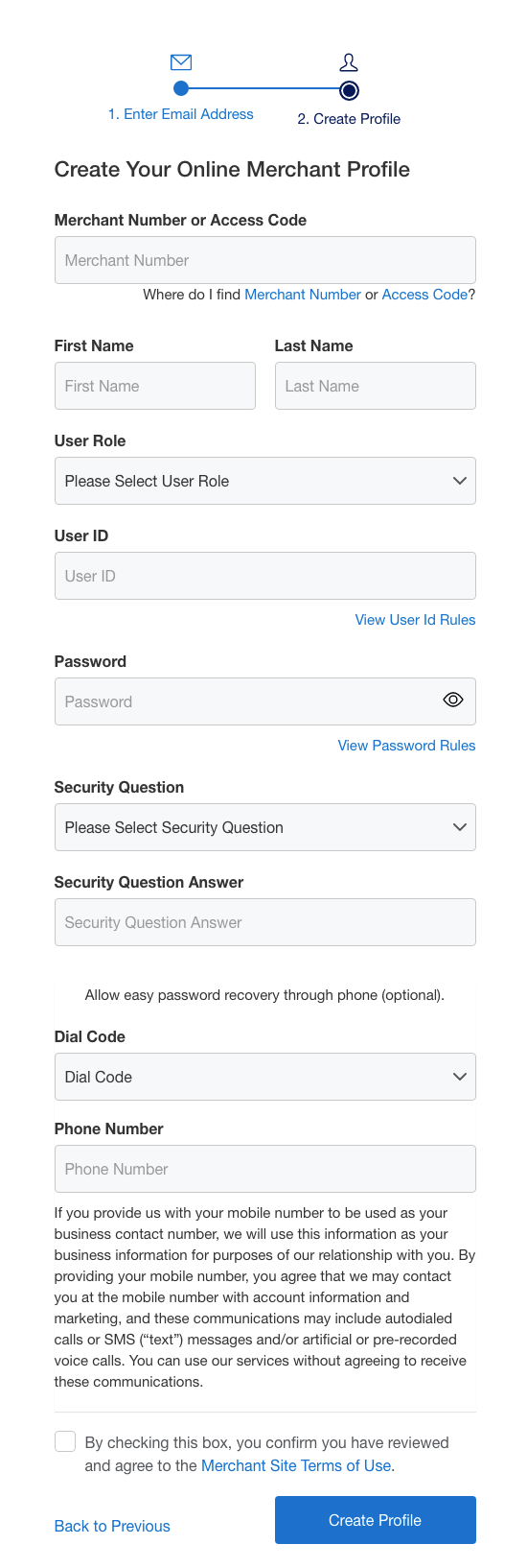
New Registration
Step 1
Step 2
Confirmation
The Result
Desktop conversion rate increased 100%
Mobile conversion rate increased 637%


